Music Meets Art Vol. 6

Album art unfolded in all its glory in the second decade of the current century. The Renaissance of physical carriers began, the polygraph began to appear anew. Now all this has become a fetish character with a clear awareness that you have something physical, not digital.
Covers and release design appear in at least two forms now - online and for sale at hand, although many musicians prefer to have both. Album art almost became like water droplets in the ocean. But still, even among such a multitude, you can, using special filters, find worthy representatives.
The decade is not over yet, so your attention is cut at the end of 2017. 12 covers, 12 performers, and 12 for this decade - not the final number. After all, a few years are waiting ahead!
Album art for this band from Boston is made according to all the traditions of stoner and doom genres. Elder themselves have become one of the standards of styles, now sounding from every soap dish music lover. The band has its own official artist, whose name is Adrian Dexter. In his portfolio, you can find designs for all releases of Americans.
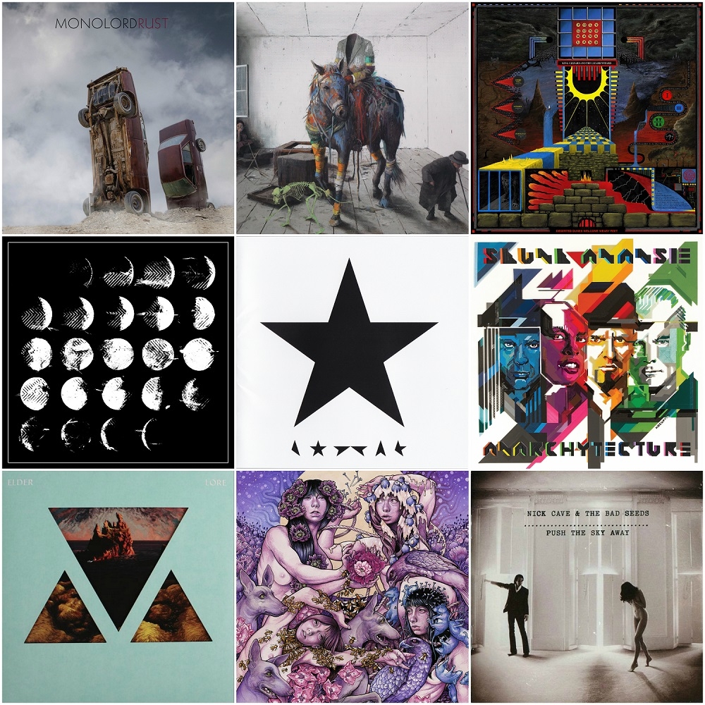
"Lore" of 2015 stands out against the background of general psychedelia and gloom with its more cosmic tones, blue hues, which immediately cause associations with something planetary, global, for example, the unity of man and nature. And, of course, there are mountains here. Only mountains in different colors and at different times of day can be more beautiful.
On the design of the penultimate release of the band, one can see how the elements change in a specially rounded image, and with them the tone. Dexter clearly caught the mood of "Lore" and served them without a drop of something dark, but on the contrary - pulled a dense, viscous sound to the surface and let it inhale with wind.
Everyone knows that Jacob Bannon from Converge is a true artist, and also in the visual arts. He has a company Atomic! ID, which is all about art. Their service package includes, for example, album artwork, clothing design, art prints, graphic design, band logo and more.
In particular, Bannon made the shirt design for the online boutique of Jamey Jasta from Hatebreed. Yes, hardcore people also have their own high fashion and appropriate stores.
By the way, it was the frontman of Converge who invented the skull with wings, so popular in the punk community. Now ther are a lot of fakes and copies of the original Bannon's work. That's how hardcore becomes mass culture. As an artist and designer, he worked with many bands, including As I Lay Dying, Every Time I Die, Fall Out Boy, Knut, Martyr A.D., Nine, Norma Jean, P.O.S, Sepultura, Underoath, etc.
Jacob Bannon made black and white art of 2012's album of his own band. On it, he depicted the phases of the moon, only as if their image was stamped with his fingers, and a certain texture remained in the photo. As can be seen from the picture, the cycle of images begins with a dark upper left corner and ends with the same dark right lower corner.
The release itself came out very personal for the frontman, and its name was taken for a reason. Each song reflects his personal experiences for the past five years before the release of "All We Love We Leave Behind".
What can you say about the strangest and most famous Australian artist? His 2013 album "Push The Sky Away" has taken all possible high positions that one can imagine. A cover of release is not far behind the content. It was also noted by the top editions as significant.
And in fact, art is quite simple, but beautiful and not devoid of meaning. It is a photo of Nick Cave, who opens the window shutters and lets in light that falls on the body of his naked wife Susie Bick, standing nearby. At that moment, she goes on tiptoe somewhere, covering her chest and face. The picture was taken by photographer Dominique Issermann right in the bedroom of the couple. And it's all decorated in sepia tones.
And it seems like everything in the spirit of music and the usual mood of Nick Cave, but not quite. During the release, the performer with the band moved away from the usual ballads and a large number of keyboards. They decided to produce more minimalist material. The entire recording took place in an old XIX century mansion in the French commune (this is a territorial unit, not a hippie settlement - aut.) Saint-Remy-de-Provence at La Fabrique studio, which also could not but affected at the sound and mood of the album.
Lyrics and themes Nick Cave took from his own search queries on the Internet and information from Wikipedia, which he used during the year. For connoisseurs and curious, the film "20 000 Days On Earth" came out in 2014, which tells about the record "Push The Sky Away".
Electronic music is getting more and more popular, so lovers of authentic sound will have to accept the fact that there is something else on the planet, besides tam-tam and cave howling. In today's realities, experimental sounds and rhythms tightly ring the modern underground stage. An excellent example of such trends is Squarepusher with its crunching intellectual music. No wonder they say that Tom Jenkinson plays drill'n'bass.
Album art to his LP "Damogen Furies" should definitely be put on the interesting covers of today. It seems to be performed indistinctly and without frills, but with taste and black and white charm.
The album design was made by English studio Build together with Squarepusher fan - Michael and photographer Timothy Saccenti. The very picture of the culprit broken music was taken in East London. For a fan of creativity Tom Jenkinson, developing his cover was a special honor, as he had dreamed of such cooperation for over 20 years, since he saw Squarepusher's performance in 1995 in Sheffield.
One girl, a very big connoisseur of Brett Anderson's art, said she was very afraid to listen to the reunited band Suede. What if something is not right there, but to be disappointed or even not to “live through” something like this is not an option at all. In fact, everything turned out to be done as it should and according to all the canons of the genre.
One of the creators of brit-pop did not disappoint with the covers even after a creative pause. Two bodies are engaged in something incomprehensible in a sweeping signature, the young lady in a dress sinks or falls somewhere, and the unknown erases her paint from her face. And all this is like in watercolor.
It is reliably known that the "Bloodsports" was made by two Englishmen - the photographer Jonathan Baron and the multi-maker Matthew Holroyd. The first has its own studio engaged in art and fashion filming. In addition to Suede, he managed to work with Gap and Harvey Nichols brands.
The second is the art director and editor of many projects. During the creation of the cover for "Bloodsports", he acted as the creative director of the whole process. He is related to Harvey Nichols as a brand consultant. Now Matthew Holroyd publishes two magazines - the satirical fashion "Vague Paper" and the porn-avant-garde "Baron & Baroness Magazine".
Another comeback, this time the alternatives from the 1990s with female vocals, sorry - feminine voice, from Skin. In 2016, the legendary and socially loud Skunk Anansie released their latest LP, "Anarchytecture". What he came out of the sound and content to judge for the most part fans. A lot of materials have already been written about this reunion and about the activities of the vocalist with and without the collective.
The cover of the release turned out to be geometric and pictorial, in the spirit of the decoration of beautiful books from the 1980s and posters of large cinemas of the same era. Then, in the fashion were smooth lines, geometric shapes with corners and non-flowing tones.
This is what it looks like on "Anarchytecture". Quartet members are shown in four different color shades. Skin decided to dress up in shades of purple. The name is stylized as a screensaver of a science fiction film of those years, or an arcade game from a game machine in a recreation park.
One would like to sit in the "Komsomolets" cinema and watch the first part of the Terminator, or go to throw 15 cents and play Sea Battle. In the English interpretation, this will probably be the series of "Doctor Who?" and Space Invaders.
Album art "Anarchytecture" won the first place on the Creative Commission website in January 2016.
It’s simply impossible to talk about this album without strain, as this is the last release of David Bowie. This is his final song of farewell to this world. Many heavy and loud speeches were written to the performer and his death two days after the release. He knew something and prepared in advance. There are many mystics and consequences too. The black star is now one of the characters of the singer, with only tragic connotations.
And the cover was made by a British artist and designer Jonathan Barnbrook. He also painted the previous "The Next Day", "Reality" and "Heathen". In appearance, the whole design looks very minimalist, but in the artwork of the last record of Bowie, many symbols and secrets are hidden.
The design of the CD is a black five-pointed star on a white background, under which the word "B O W I E" is stylized from its segments. Vinyl looks different - a black background, a black carved star and a black vinyl label itself. It is known that in Unicode the character ★ goes under the number U + 2605. These numbers coincide with the date of birth of Bowie’s former guitarist, Mick Ronson, who, like the singer, died of cancer.
Doctors also have their own special term for the development of some forms of cancer in the breast, and it sounds like black star lesion.
In addition, in the album art the mass of messages and symbols is encrypted. So, if the plate reflects light, then side A will display the bird in flight, and B - the spacecraft. Under ultraviolet radiation, the star on the album shines blue. If we put it under solar radiation, then clusters of galaxies appear inside the image.
The vinyl booklet is encrypted with 3D images of a star, a woman, a man, and the inscription "Lazarus". To do this, you need to bring a flashlight to the printed liner and enlighten it. The author of the design itself says that in the release there are several hidden black stars and each of them means something different.
A little about the fluency. There is a British sludge band Lazarus Blackstar, who beat St. Vitus in her video long before the release of the star album. In addition to the similarities in the names, there are also some similarities in the clips of the performers. These are the above-mentioned movements of patients with chorea and bandages on their eyes. However, no one has yet been able to confirm or deny the theory of the influence of the British on the pre-death music of Bowie.
Perhaps another release on the complexity of perception and semantic load in this review, which also stepped beyond the limits of the standard product of mass culture. At the same time, UNKLE has long been its representative. And with the revival of trip-hop and downtempo, they generally became on the crest of a wave.
But James Lavelle decided to sink further and go deep, he said, into the roots. To that London, which was 20 years ago and where the new electronic flow created by its project came from. "The Road: Part 1" is difficult to understand and incomprehensible from the first time. The sophisticated listener risks diving and hitting his head on the flooded Thames pier, and the seeker of sound excitement will go to the disco (excuse me, rave) after the first listening.
The cover of UNKLE saturated in meaning and execution. It has a child, a cube, a dog's skeleton, a small man with a wand and wearing a hat, paint, a horse, a horseman without a head and with the flag of Ukraine on his sleeve. All this is great for finding deep meanings and wrapped plot lines in a static image.
The album was designed by Jonas Burgert, a Berlin artist, whose works, in addition to the capital of all Germany, can be viewed in galleries in Hamburg, Venice, Stockholm and even Beirut. UNKLE's album art also includes a 36-page booklet that includes works by artists, filmmakers and photographers Nathan Coley, John Isaacs, David Nicholson, Norbert Schoerner, Doug Foster, Warren Du Preez and Nick Thornton Jones, with whom the band is currently collaborating or worked before.
Since we are a publication about the underground and the heavy components of the musical culture not only of a moral level, then teams from niches with dense, strong, harsh and powerful sound will close our material..
Let's start with the Australian prog, psi and the garage rockers King Gizzard & the Lizard Wizard. One of the five albums released by the band in 2017 was called "Polygondwanaland". You can read a lot of laudatory reviews from their colleagues, as well as reputable world music publications, about the complexity and quality of the performance of songs by the band. More interesting is the fact that with this release the band breaks the system completely, literally throwing the master wav into the network to print vinyl, discs or even tapes, say, release anyone who wants.
And the design itself directly corrodes the eyes with its richness of colors and meanings. On the cover, in addition to the traditional name of the band and the album, all the names of their songs are written in different segments and different fonts.
This release was designed by artist Jason Galea, who worked with the band before. A very interesting fact from the artist's life - he became interested in creating animation when he was ten years old. His first program was Nickelodeon 3D Movie Maker, in which he created his first visual images using characters from Ren and Stimpy, New Life of Rocco and The Real Monsters. Such child's creativity could not affect the further work of the animator and artist.
Since 2009, Jason Galea held exhibitions in the countries of the two hemispheres - Australia and the USA. True, there has not yet been a single personal one, but he has already perpetuated himself several times by working with one of the most perspective band in this field.
One of the most striking design works can be called Baroness album art on their latest LP "Purple". The work belongs to the hand of the author John Dyer Baizley, who actually is the vocalist and guitarist of the band. On his own website, you can familiarize yourself with the art that the artist produces. Quote from Wikipedia: "Kvelertak, Kylesa, Pig Destroyer, Darkest Hour, Daughters, Skeletonwitch, Torche, Cursed, Black Tusk, Vitamin X, Flight of the Conchords, The Red Chord, Gillian Welch, Metallica" is a list of teams that John Dyer Baizley did the artwork and various art solutions. "In bands you can immediately understand and be convinced of the level of his skill.
And here parallels with the frontman of the Converge band, Jacob Bannon, discussed above, immediately come to the fore. By the way, in one of the recent news publications on the site of the "ideal monster", one artist mentions another. In general, there are many interesting names in the site links, in addition to the hardcore vocalist and colleagues of the sludge metal formation singer soloist: Nath Cöre, HUSH, Paul Romano, BRLSQ, Monolith Press, Junkyard Arts and many more.
Baroness (John Dyer Baizley) - more than once became responsible for the visual part of the famous Dutch festival Roadburn and once in 2017 even became the curator of a whole festival day, organizing a line-up from favorite and friendly bands.
As for the very design of the album "Purple", then you can look at it endlessly, without stopping and periodically receiving aesthetic orgasms from a similar approach to album art..
Cover art of Bell Witch's album "Mirror Reaper" can rightly be considered another memorable masterpiece of viscous, heavy and slow genres. The Doom band from Seattle is close in spirit to its Baroness colleagues and, by concept, to other associates - the Sleep band. In their latest release, they released just one track, 01:23:15. All the canons of the genre.
But for the design they took the picture of the Polish surrealist Mariusz Lewandowski, who is as famous in the world and in his native spaces as his colleague in easel painting Zdzisław Beksiński. Both were born almost at the same time in 1931 and 1929. Both wrote on the same subject - religion, gothic, society, and all this was seasoned with a gloomy fun.
It is unlikely that they were fighting each other, rather became the founders of the Polish school of this direction. Mariusz Lewandowski, like his colleague, left behind him such an impressive amount of work that there are plenty to choose from for groups flirting with otherworldly and otherworldly topics.
On the "Mirror Reaper" we see a classic plot: a creature with a scythe, fire, mountains, a clash of night and day. But visually it is presented in such a way that I want to dwell on every little thing, every detail, every shade that comes across in the struggle of the elements. Bell Witch made a very good choice for their latest album.
The Swedish band Monolord and their LP "Rust" closes the list of the incomplete decade. Strong stoner-doom from a country of developed socialism is illustrated with an installation very reminiscent of the sculptures of the Burning Man festival. Images dug vertically into the sand machines cause direct associations with the recently launched golfstream event in the Nevada desert.
The bottom of one of the cars has a characteristic worn brown color. This is not surprising, if only because the car could go age, mileage and end the limit of tolerance. But, most likely, such an emphasis on the rusty bottom on the design is made due to the fact that the album name is translated as "rust".
Whatever it was, the last three designs can be safely put in the standards of the decade. Perhaps their richness and depth of supply to the public is connected with the fashion for viscous and slow directions. No wonder that now overloaded fuzz can be heard from each glass with a smoothie. Or maybe the time has just come, and the trends have redefined themselves. After all, this segment of heavy genres always has the appearance of a sound and clothing product on a level.
This material is not the final verdict of the current decade, because it has not yet ended. How much more will be released in the next two or three years, and how many will be drawn, written and adapted from the old!
The material was read, supplemented/trimmed, commented: Philip Dobrov, Valery and Yulia Kornevy, Alexander Masovets, Yarina Denisyuk. Thank you very much!
To be continued…
Material was made in support of:
RobustFellow Bandcamp Facebook VK Twitter
Ethereal Riffian Bandcamp Facebook VK
All the parts of the material are here:
https://www.neformat.com.ua/rubrika/music-meets-art
All images are copyrighted by their respective copyright owners.


